
Struggling to get donations on your charity website?
Have you tried every trick in the book to attract donors but haven’t succeeded? Confused about how to persuade people to donate?
As someone who truly believes in the cause you’re promoting, it can be heart-heart-breaking to see people leave your website without donating.
You need to get some facts clear:
- The competition in the non-profits segment is intense. Lots of charity sites out there seeking donations but not all get it.
- Just 2.4% of the charity sites, out of 1.56 million, account for 90% of the total reported revenue, according to the National Center for Charitable Studies data in the US.
This simply means that:
- Charity sites have to work harder for donations
- Studying the best websites in the business helps you an understand the psychology of giving and how to leverage it for driving donations.
Here are 6 simple tips to make your charity website more persuasive:
1. Use the power of YOU
One of the biggest mistakes in the copy of charity websites is getting overly busy about talking about the brand and not talking about customers.
As Donald Miller, in his book StoryBrand says: In a story [read that as your website] the brand is the guide who helps the customer solve a problem. The customer is always the hero in your story.
Understanding this simple fact can change the copy orientation in your website.
The key to persuasion lies in the ruthless focus on the customer, not self-obsession with your brand.
- What’s in it for your customers
- How do they benefit
- How easy is it to donate
- What proof do you have to make what you say credible
The website is not about you, but your customer. The copy for your website should be addressed to a real person: Your customer, the donor.
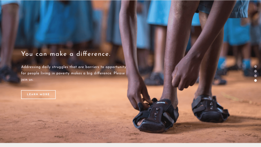
The Because International website shows how You can make a difference.
The best way to do this to check for and remove all references to We/ Our/ Ours/ Your Brand Name and convert this into You/ Your.
2. Address the power of one
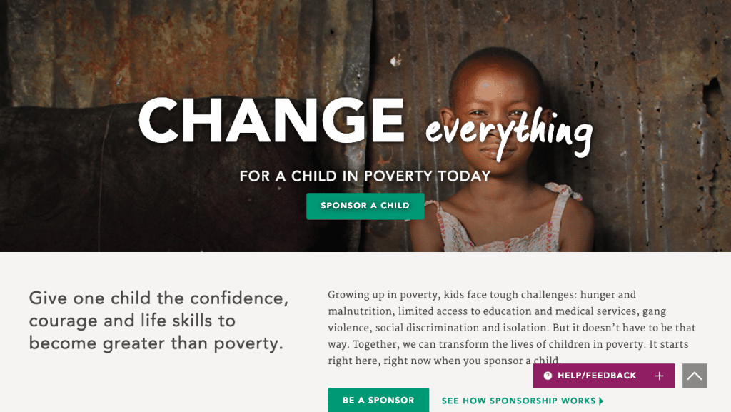
The Children International website chooses to make one identified child the focus of its messaging. Research shows that this works better than showing a whole bunch of children.
It isn’t that you need to change global poverty, or that you even can because the problem seems insurmountable. But you can make a difference to the life of one child and that’s what you need to focus on.
The copy uses “You” and “Together” to bring about a difference to the life of the girl who faces poverty.
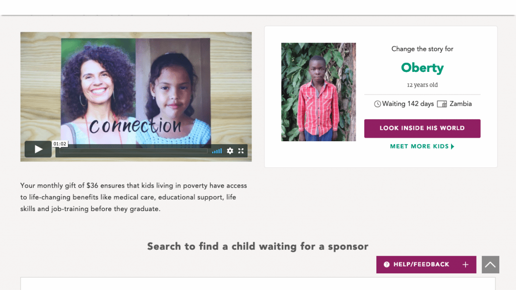
The second panel of the site shows a video of how your contribution of $36 ensures access to life-changing benefits for a child.
The exhortation to change the life of a specific child is also clear.
That the child is waiting for you to donate for 142 days tugs at your heart-strings.
Below that you have the choice of searching for a specific child and sponsoring that child.
Very emotional copy, and very insight-driven appeals to donate through stories of children in need.
3. Tell a story
Everyone loves a good story. The best way to persuade someone into making a donation on your website is by telling a story.
- What problem does your charity solve?
- How do you use the donations you get for making a difference?
- What changes have you brought about so far?
- Why should I contribute to this cause?
- Who will benefit from it?
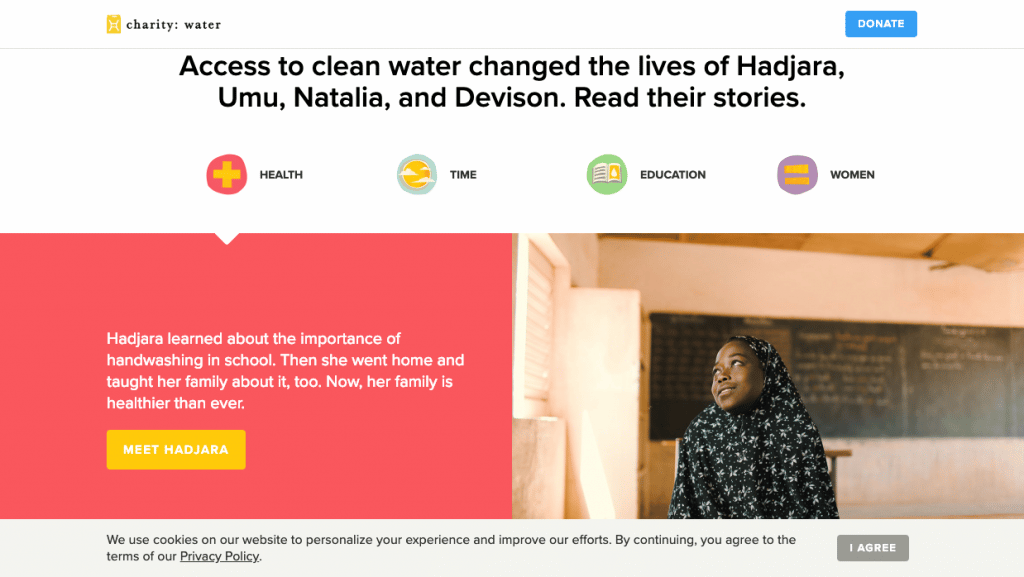
charitywater.org uses storytelling excellently to put across their message.
4. Make donating easy
What’s the purpose of your website?
Getting more donations, right? Or more volunteers? Or help people raise funds?
Decide what’s primary and what’s secondary. Use color codes to differentiate the primary from the secondary objectives.
If people visiting your website can’t find the Donate Now button easily, how will they donate?
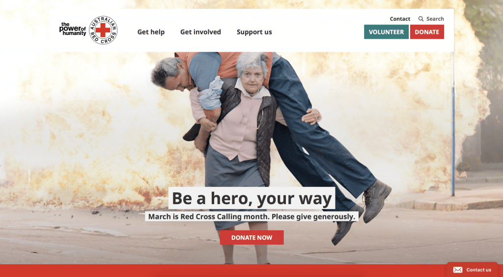
Red Cross society, Australia has clearly identified that Donate and Volunteer are its key calls to action. The information architecture is also focussed on the customer action, not on the institution or brand. Notice that it uses active verbs in the navigation.
The option to make a donation shouldn’t be hidden or difficult to find. It isn’t something you should have only in one place or just once on the website.
At every step of your persuasion, you must have calls to action.
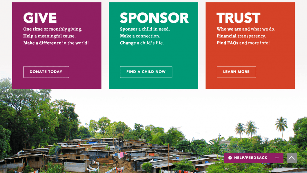
Children’s International does a a great job with its calls to action. Note the use of active verbs.
To make trusting your charity simpler, it’s also idea to add a Learn More button which leads to the About Us page.
Some people are not ready to donate, or even volunteer. They may need some time to do it. In this case, use an eBook download to capture their interest.
The eBook should explains in detail what you do and why people should associate with you. Or get them to subscribe to your Newsletter, first.
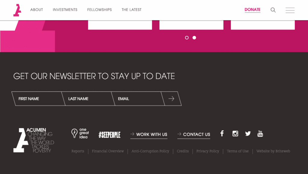
Acumen uses the Newsletter effectively to capture folks who need more time to decide. This way, Acumen captures then prospects and then uses an email nurturing campaigns to build trust with the prospect. Trust then drives action.
5. Use soothing colours
Colours play a very important role in deciding how people look at your brand. For a charity website, this can be a deal-breaker. Colours are just as important as words.
The emotions you are trying to evoke are that of empathy and compassion. You also want the donor to feel proud and humbled after making a donation and helping someone in need.
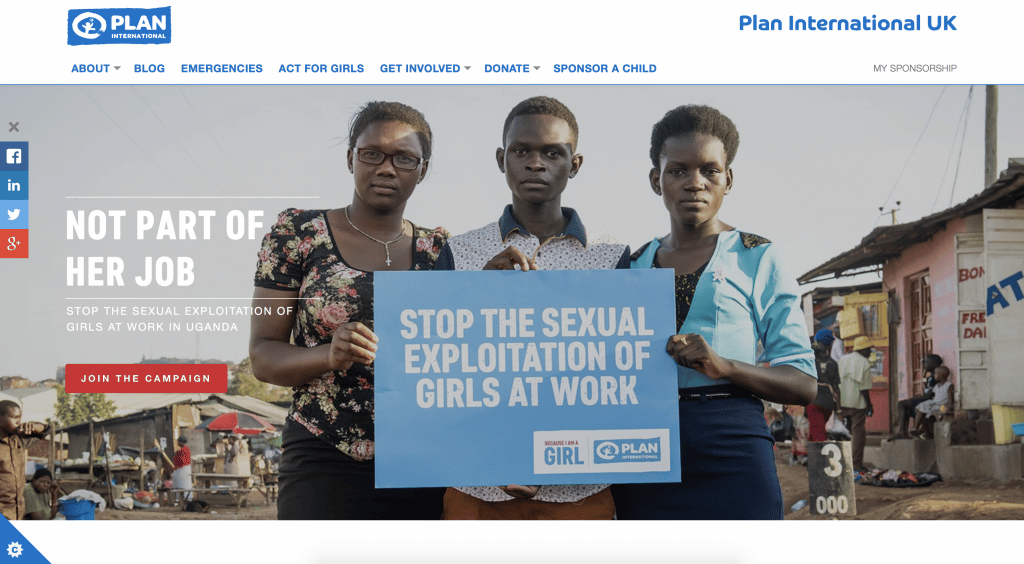
Plan-UK uses blue, one of the most soothing colours to get donations on their website.
Avoid using extremely bright colours or graphics. Ideal colours for a charity website would be shades of blue, purple, green, black or grey.
6. Ensure your website loads quickly
This is one of the most commonly overlooked aspect when designing a website. Website designers are often so focused on making it look good, that they forget taking the page load time into consideration.
Your website could have the best persuasion in the world, but if it doesn’t load quick enough, people won’t stay.
Research says that, on an average, a person won’t wait longer than 3 seconds for a webpage to load. If your website doesn’t load within 3 seconds, they leave.
So how do you test your website performance and load time.
Head over to GTMetrix.com and put your URL into the box. Check the results.
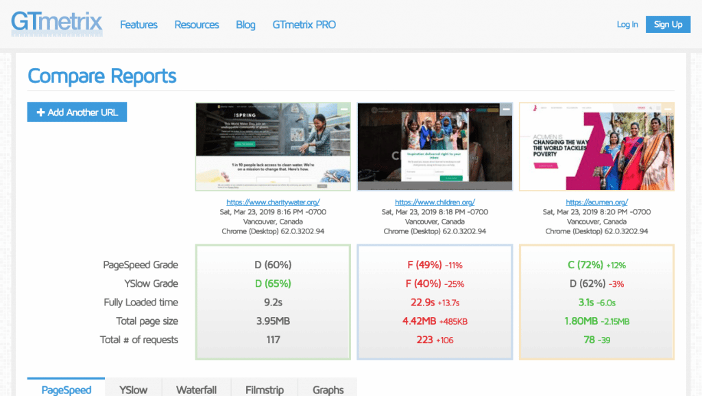
Of the 3 websites we compared, Acumen scores the best in terms of performance.
The 6 takeaways for your charity website from this article
- Make your customer the hero of your website
- Talk to one person about the change he/she can bring to the life of one person
- Tell a compelling story, or use stories to drive action
- Make the process of donating easy
- Use soothing colors
- Ensure that your site loads fast [in under 3 seconds]
Follow these 6 tips and make your charity, or non-profit website, more persuasive.
Krishnan Unni is the digital marketing evangelist and Founder of Pigtail Pundits, one of India’s leading digital marketing agencies.