Restaurants, just like any other business, strive to reach new customers and increase their sales. To get more people through their doors, managers schedule various events that attract interest among different audiences. But often, it isn’t enough to organize a great event, you will need to advertise it and catch people’s attention. Only then can you expect customers will attend your event and make it worth your time and resources.
There are several strong marketing techniques you can incorporate into your marketing strategy to gain success. The first step is obvious in the digital era, you need to advertise it on social networks. Put your social media accounts in use, from Facebook, Instagram, and Twitter to YouTube channels and TikTok. Don’t forget about the old-fashioned way, put posters on local bulletin boards and give flyers to people.
Here we will give you a few tips on how to create better posters for your events, organized by restaurants or other businesses. As far as today, old ways of marketing are still effective, so you cannot overlook them when initiating a successful marketing strategy.
Why Should You Use Posters?
Besides its simplicity and the fact it’s a low-cost solution for mass marketing, posters are easy to distribute and, if created properly, can grab people’s attention very effectively. One more trait of the new age is the expansion of many online poster-maker tools that give you the ability to create posters on your own. You don’t need to employ anyone, with just imagination and time, you can place all the necessary elements on the poster, and create a unique pitch for your audience. You can even try creating posters with Adobe’s free tools, which offer a range of striking poster templates to choose from.
This will save a lot of your budget money and allow you to use those funds for other marketing channels or something else.
One more advantage of posters over digital advertising is that they target all customers equally and are placed throughout the whole day. Digital campaigns need to be targeted to select audience demographics and to be sent out at particular times during the day. If your poster is well positioned, it will be seen by anyone who walks past your restaurant, so proper optimization of visual elements is a must. The best posters are ones with relevant visuals, short and on-the-point text, and an effective call to action in a prominent place.
The posters are a great way for creative people to express themselves. You are limited only by your imagination but don’t use too many visual elements. Keep in mind that your event needs to be in focus and the main information regarding it. Choose the size of the poster, set up a layout, and think about what you want to achieve with it (besides the invitation). Make it unique and recognizable so it can stand out from others.
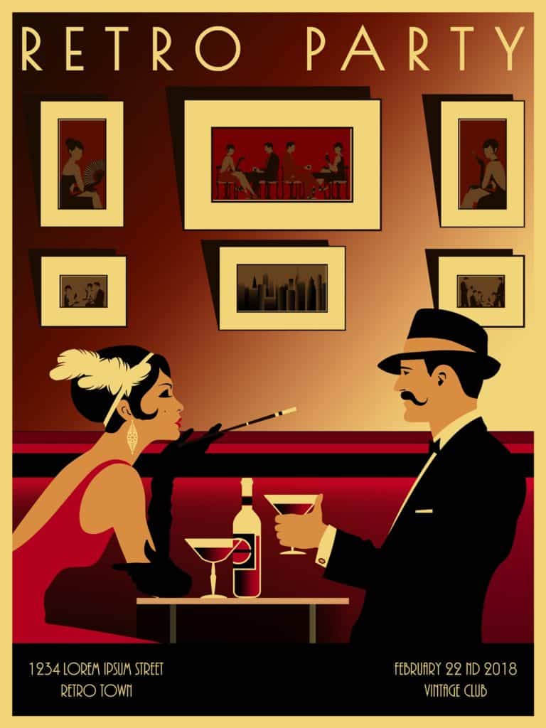
As one can see from our example below, the color scheme is relevant to the theme of the event – it gives the viewer a sense of old times. It is, at the same time, nostalgic and informative. The theme is a retro party, so the dominant place of the poster is the picture of a lady and the gentleman that gives all the info about what is expected from you and what you can expect from the event. At the end, the final touch is info about the venue and date. That info needs to be written in a font large enough that can be easily read from a distance.

You can also make variations that will appeal to different audience segments – such as a more cartoonish version for younger people or using visuals about pop culture for less business-oriented audiences. It all depends on what you will organize and what audience you want to invite to your event.
What Your Poster Needs
It is not an easy task to create a poster that will market exceptionally for your restaurant’s event. You can easily get into the trap of placing too many unrelated elements or creating too big posters that don’t give enough info to the audience. You need to carefully plan what visual elements you want to see on your poster and where to place them.
Focus on providing information to your audience, adding a call to action only at the end. In between, you can add something catchy, fun, or more informative. If you differentiate your posters into these three parts, you will ensure continuity of reading and keep the audience interested. If you manage to hook them up, they will be more likely to attend the event you advertise.
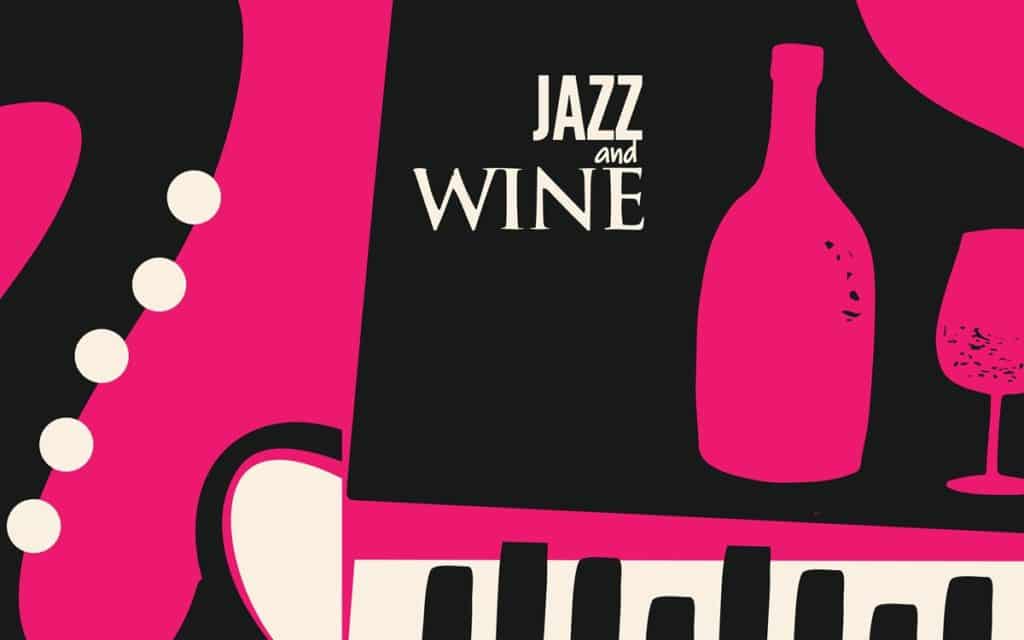
An event is a fun experience, especially when there is food and drink involved. You can schedule a music & drink fun night and create a poster similar to this one:

You can’t only rely on the attractiveness of your poster; you need to optimize the information for your target audience.
Always try to create a catchy slogan, that will be both informative and inviting. Some of the examples are:
1. “Taste the Magic: A Gastronomic Extravaganza!”
2. “Feastival: A Celebration of Food, Fun, and Fantastic Flavors!”
3. “Foodie Fiesta: Where Every Bite is a Party in Your Mouth!”
Conclusion
You now know how to create better posters that will promote your event. The last step is to place them in prominent places where they will attract clients to attend your venue. Never forget to place all the necessary info on the poster. Draw attention to a central element or message by using size, color, or placement. This focal point should immediately capture the viewer’s attention and convey the essence of your poster.
If you need inspiration, check out what your competitors are doing, or search among templates available online. You will surely find something that will inspire you and give you a much-needed boost.
